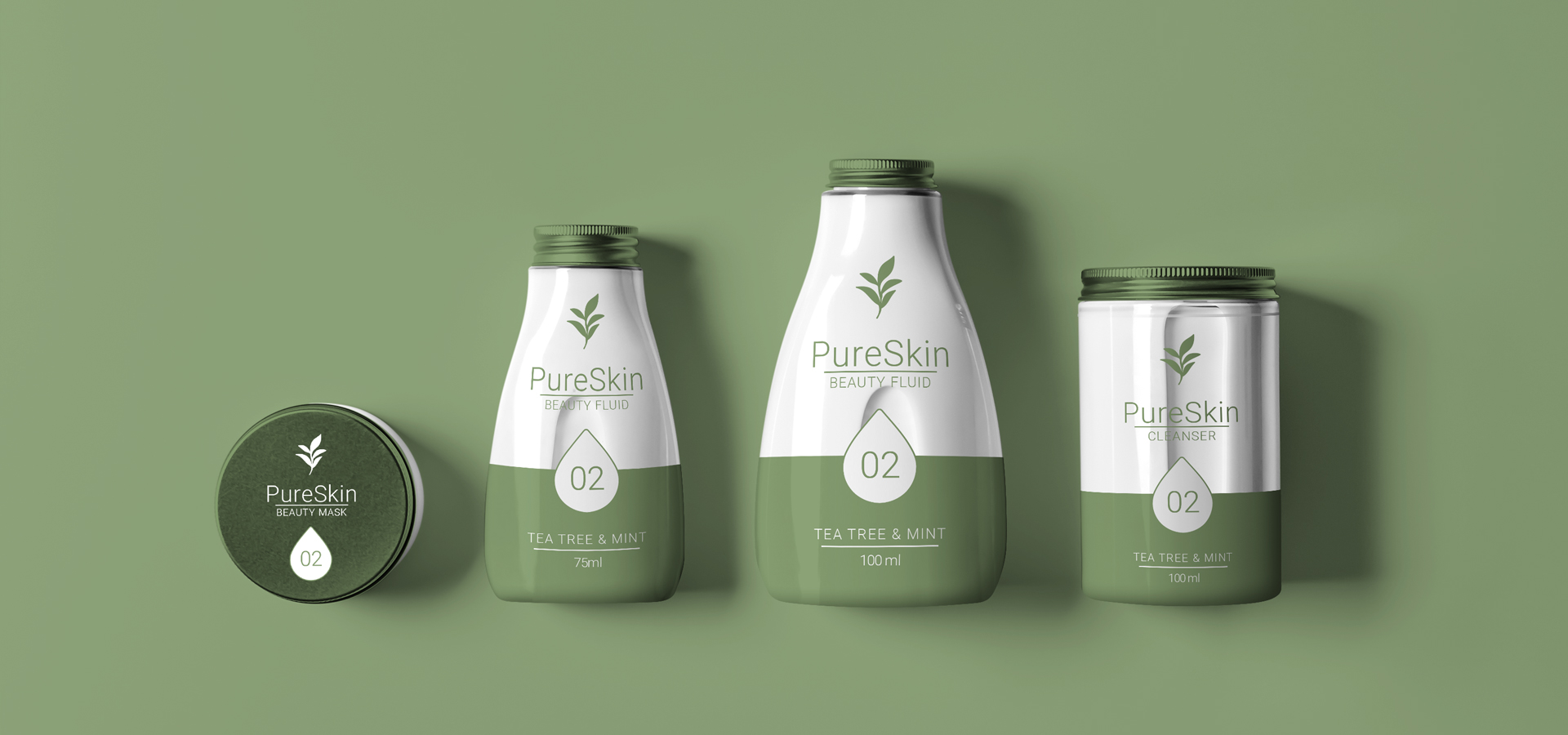
PureSkin Beauty Co: A fresh take on natural skincare
At Grace, we believe that great design has the power to elevate a product from ordinary to extraordinary. When we were approached by PureSkin Beauty Co. to create the brand identity and packaging for their new natural beauty product, we knew we had an exciting opportunity to craft a visual experience that would reflect the brand’s core values of purity, nature and sophistication. The result is a product that not only captures the essence of its natural ingredients—tea tree oil and mint—but also tells a compelling story through thoughtful design.


Thoughtfully crafted, beautifully sustainable
We approached the design process with one goal in mind: to create a brand identity with a clean, minimalist aesthetic that emphasises simplicity and purity.
For the brand identity, we chose a colour palette inspired by nature—muted soft greens and crisp whites. Colours that convey the freshness and calming qualities of the tea tree and mint ingredients, while also evoking a sense of subtle sophistication. The typography is modern and clean, ensuring that the brand feels both contemporary and timeless.
The packaging was designed to be as elegant as it is functional. We selected high-quality, sustainable materials to align with the brand’s commitment to the environment. The packaging features smooth, simple lines that are easy to handle and display. Subtle botanical illustrations were incorporated to visually communicate the natural essence of the product, while the minimal label design allows the brand to stand out in a crowded beauty market.


Design that reflects nature’s beauty
The PureSkin Beauty Co. identity and packaging we created is not just about aesthetics—it’s about creating a deeper connection between the consumer and the product. Every design choice was made with purpose, ensuring that the final product is not only visually appealing but also communicates the brand’s values of purity, quality and sustainability.


Launch. Scale. Win shelf space.
Let’s take your brand where it belongs.


